Designing an Intentional, Compliance-Ready Financial Dashboard
This project explores how to design a unified financial dashboard that brings all accounts and asset types together into one clear, trustworthy view.
Brief Summary
UX/UI Product Designer
Key Solutions
Tools
Problem
Users do not have a single reliable way to see their total portfolio performance. Their money is spread across multiple tools and institutions, each with its own layout, data refresh rate, and visual style.
Because of this, they struggle to understand their true net worth or daily changes, and often rely on manual spreadsheets to piece things together. This leads to confusion, wasted time, and reduced confidence in their
financial position.
Understanding the User
Monitoring Users
This group of users check their accounts weekly and want clarity across all accounts in one view.
Research Insights
Insight 1: Fragmentation hurts clarity
Users lose context and have to manually stitch information together.
Insight 2: A single risk score feels incomplete
Users wanted more than a number. They wanted the “why.”
Insight 3: Risk visibility is inconsistent
Risk is often buried in secondary screens.
User Quotes
"I use spreadsheets today as I have 2 taxable accounts, 4 retirement accounts, and 1 banking account all at different banks. How do you get a single view of your AA?"
+
"I am currently:
Manually updating spreadsheets
Checking 5+ apps just to get a full picture
Laggy or inaccurate net worth tracking
Budgeting apps that don’t do real investment breakdowns"
Process
Design Principles
Clarity first
Reduce noise
Unify the experience
Keep it stable
Information Architecture Update
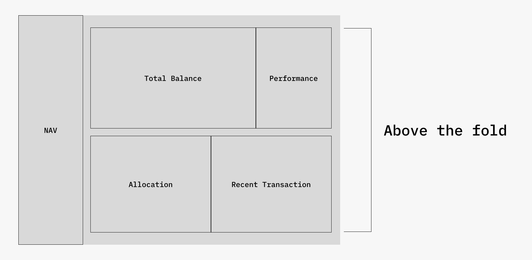
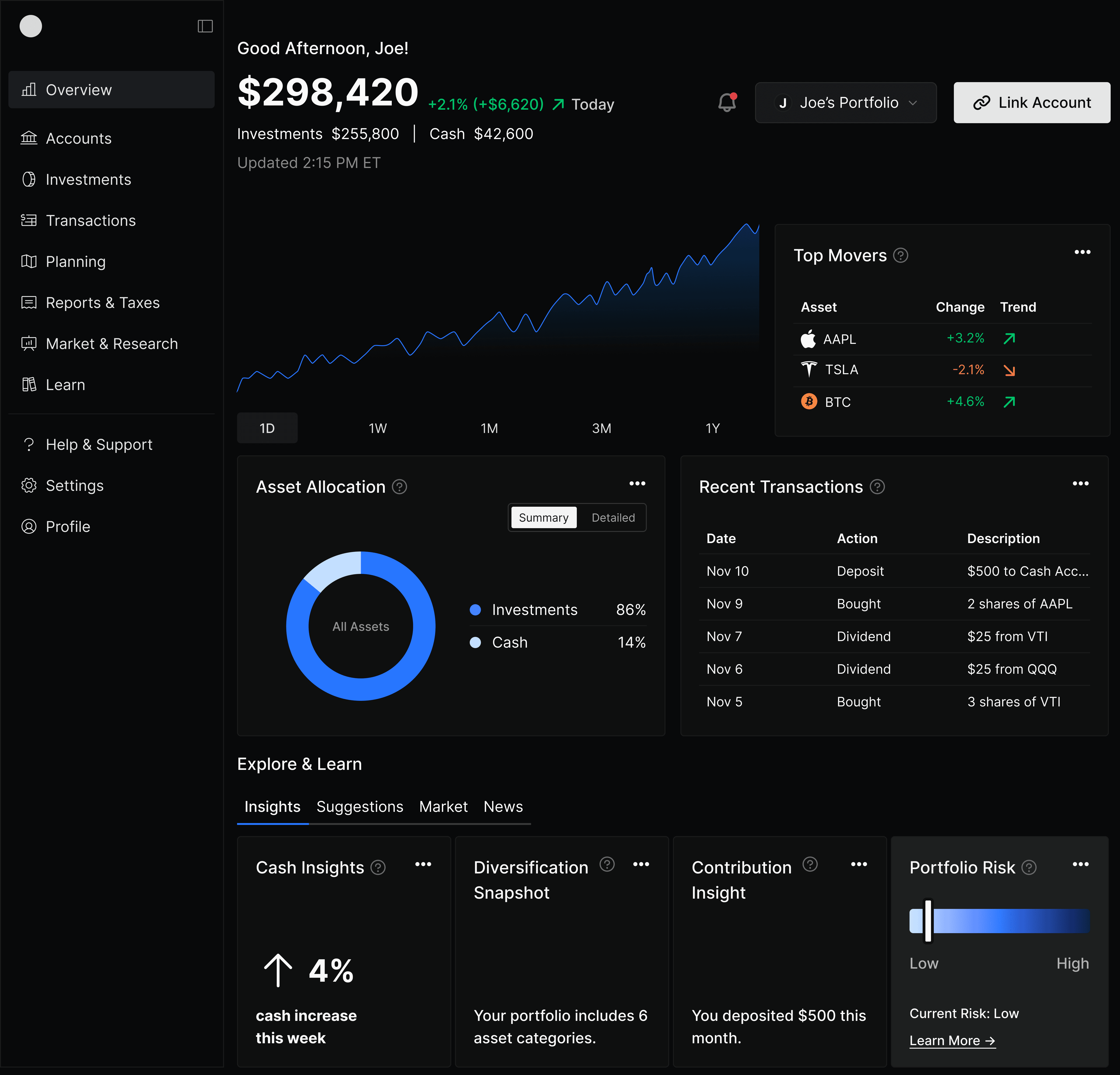
Above the Fold
This section highlights the most important and high-value information first, giving users instant clarity without scrolling.
Total Balance
Performance
Allocation
Recent Transactions
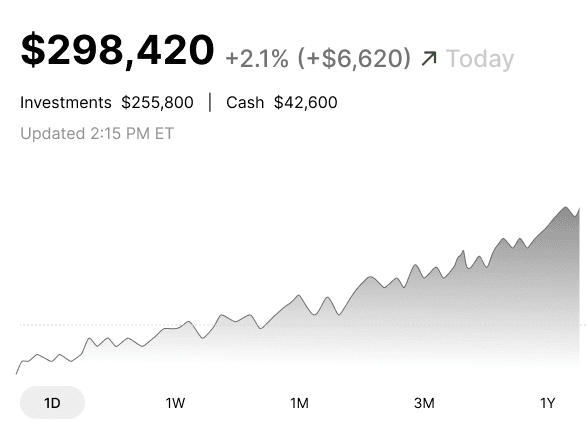
Total Account Amount &
Performance Chart
The balance anchors the dashboard, the performance chart sits directly beneath it to show how the money is moving, and time filters sit below the chart so users can change context instantly without breaking their flow.
Performance Chart
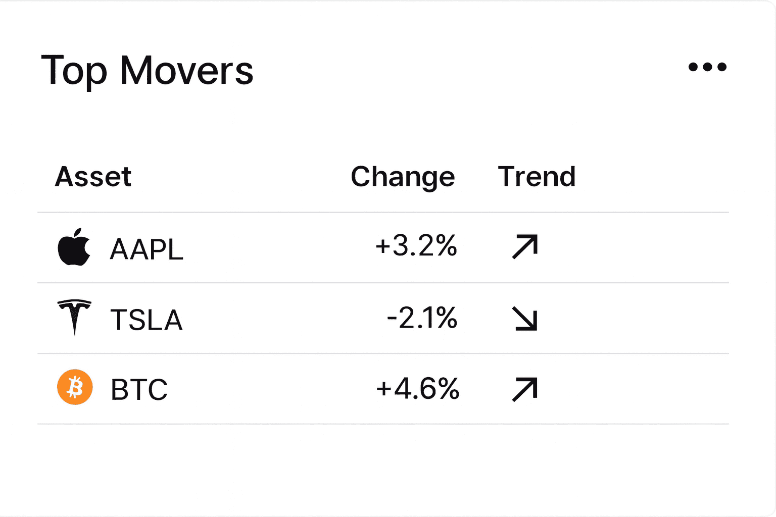
Top Movers
Top Movers
Top Movers is above the fold so users can immediately see what drove gains or losses.
Asset Allocation
The allocation chart sits high on the page because it explains the structure and stability of the portfolio. For a more granular view, users can click on "detailed" to see how assets are broken down.
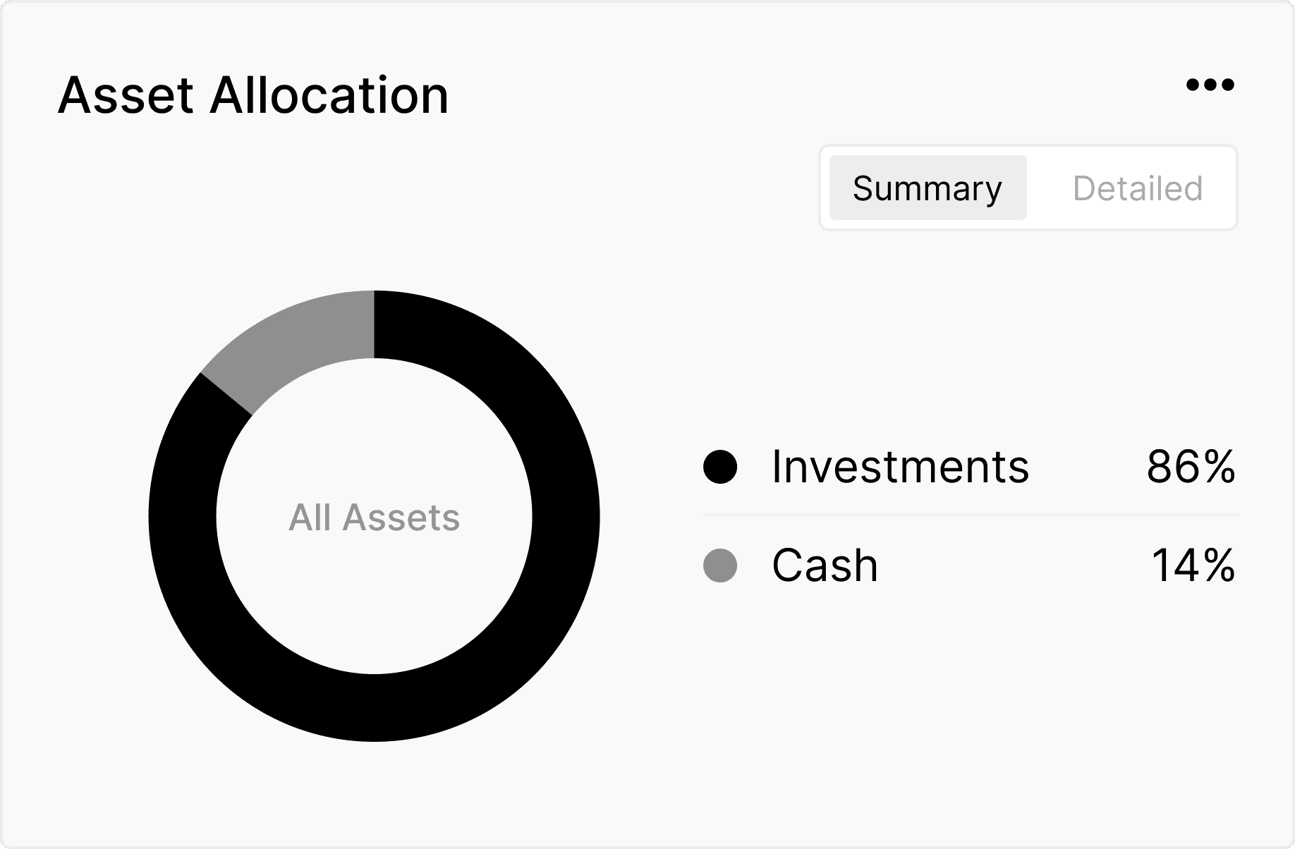
Asset Allocation Chart
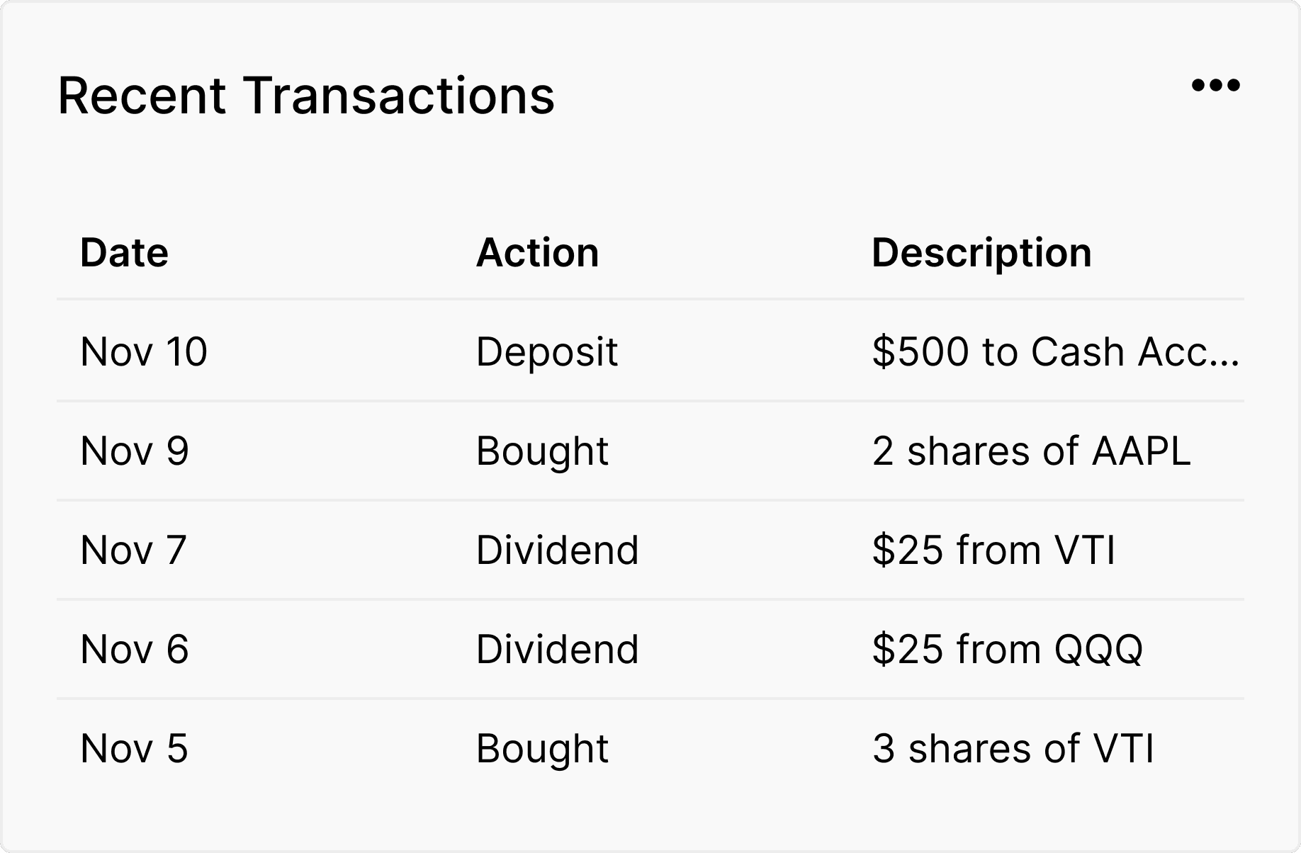
Recent Transactions
Recent Transactions
Recent Transactions is placed just above the fold to let users quickly verify recent activity without scrolling.
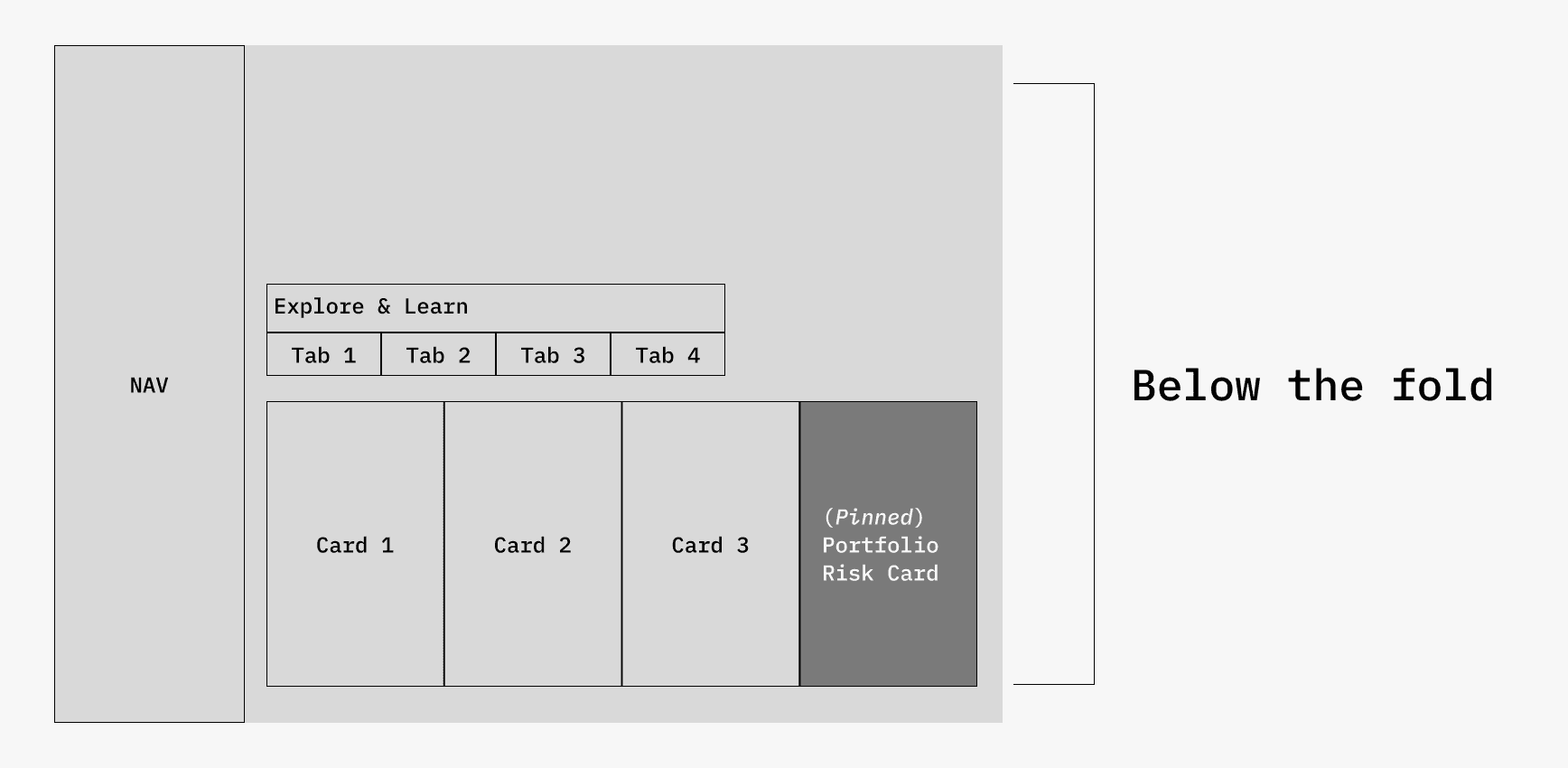
Below the Fold
This section offers deeper insights and learning tools that help users understand their portfolio more fully at their own pace. It also increases engagement by giving users meaningful content that encourages them to stay longer, explore more, and build a stronger connection with the app. These features teach users something new each time they visit, which strengthens trust and creates a more rewarding, long-term relationship with the product.
Explore and Learn
Portfolio Risk (pinned)
Tabs/cards
Explore and Learn
This section gives users a personalized space to understand their portfolio more deeply through tailored insights, suggestions, market context, and relevant news.
1. Portfolio Risk (Pinned)
The Portfolio Risk card stays pinned in this section to give users a stable reference point for risk and to clearly differentiate it from the rotating
tab content.
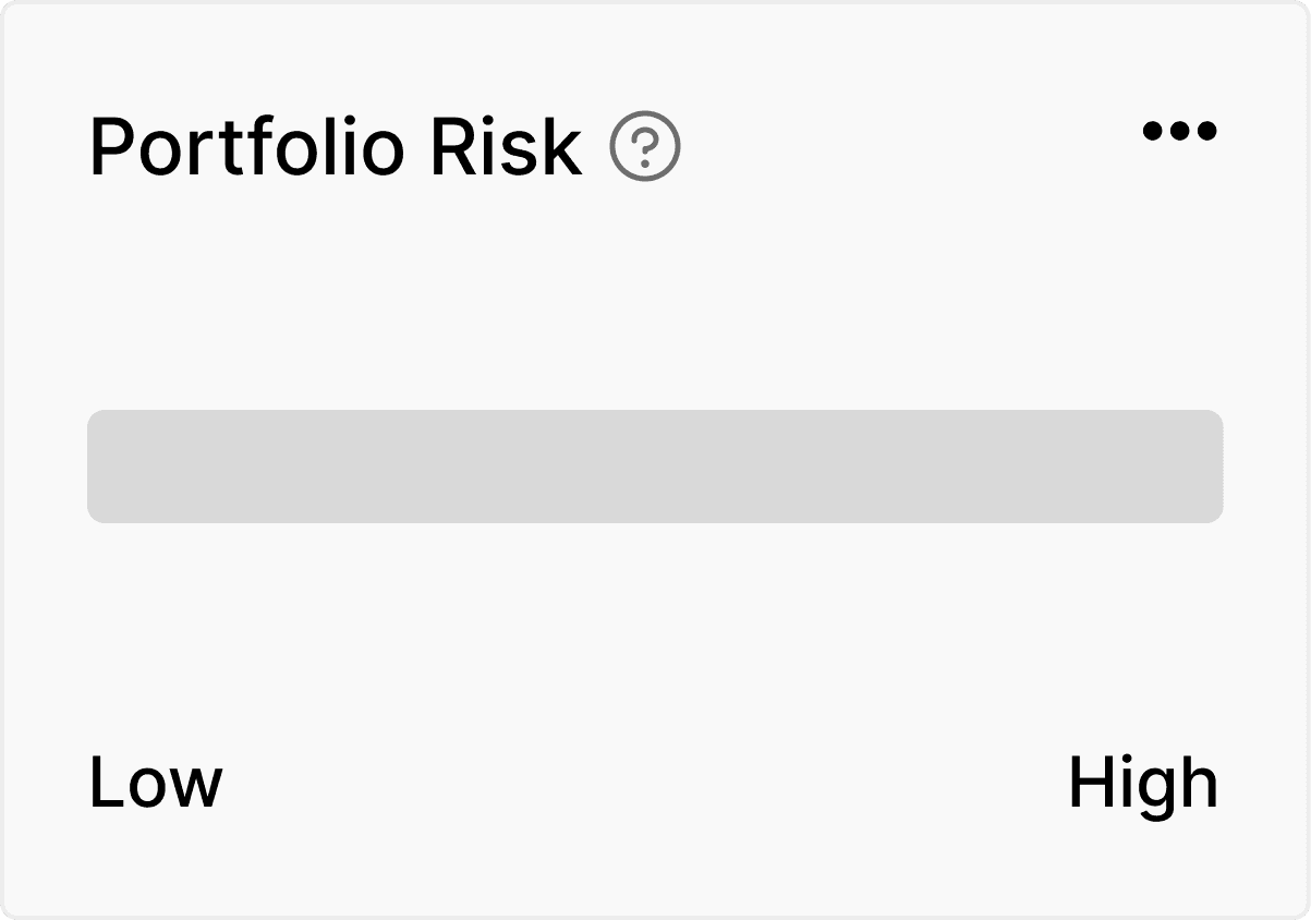
Portfolio Risk
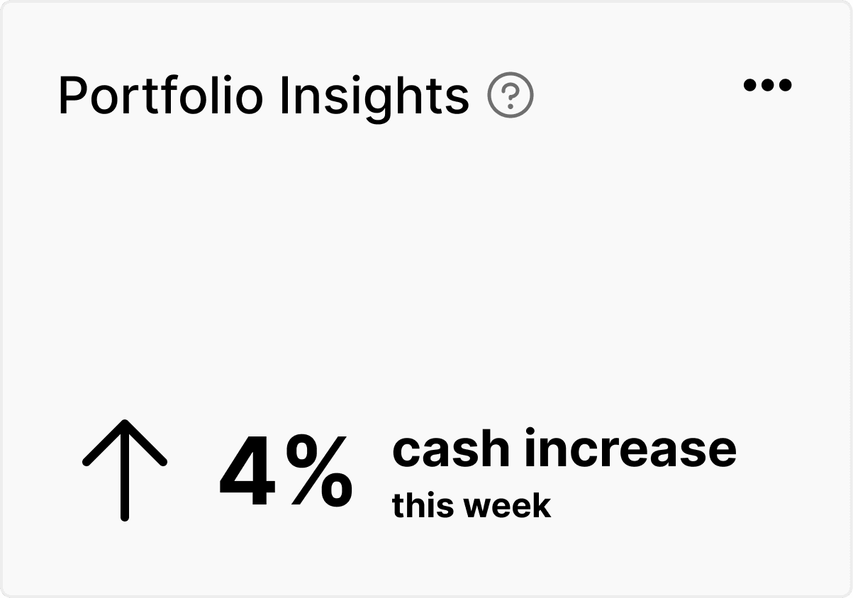
Insights
2. Insights
Insights gives users a quick overview of meaningful patterns in their portfolio so they can understand what matters most right now.
3. Suggestions
Suggestions provides simple, personalized ideas that can help users improve their financial position without overwhelming them.
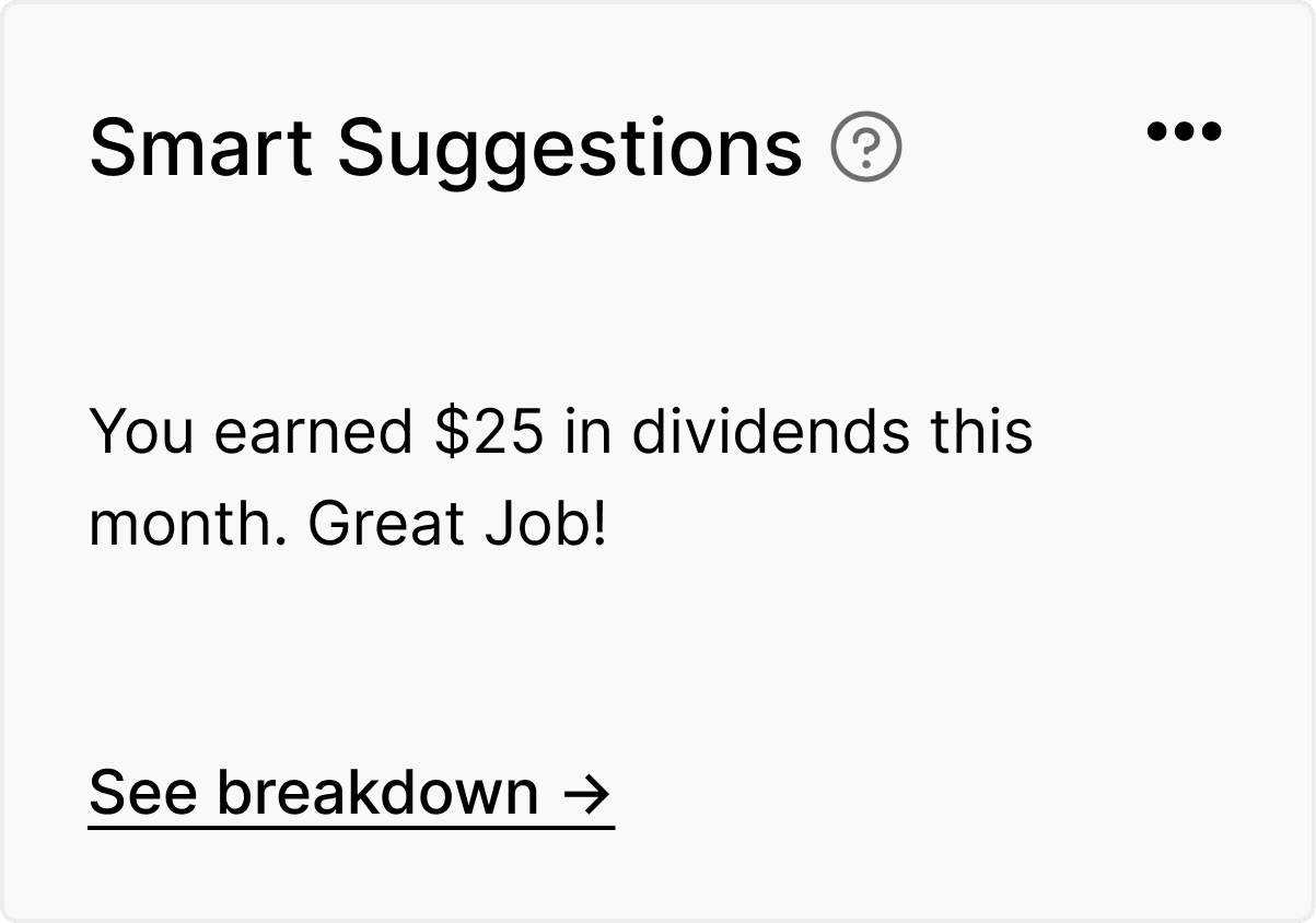
Smart Suggestions
4. Market
The Market tab highlights relevant market movements that may affect the user's portfolio and helps them connect external events to their
own performance.
5. News
News delivers curated headlines that relate directly to the user's holdings so they can stay informed without searching multiple sources.
Further Refinement
Full Screen
Refining for Dark Mode
Supports light and dark modes to reduce strain and fit user context.
Thoughtful Color Choices
Uses accessible neutrals and a semantic colors for clarity and scalability.
Tabs for Clarity
Organizes insights into simple tabs that keep information easy to scan.
Pinned Risk Card
Stays fixed as a stable reference point separate from rotating tab content.
Exploring Suggestions
Portfolio Selection and Account Linking
Lets users switch, compare, and create portfolios while easily linking new accounts to keep everything in one place.
Account Selections
Results
Increased user satisfaction
Easy to locate
need information
Future Plans
Financial Goals
Uses AI to generate personalized goals based on the user's portfolio and shows clear progress visuals that keep them motivated and engaged.
AI Financial Goals
Add AI-driven nudges that guide users toward smarter financial decisions.
Introduce portfolio simulations to show how changes affect risk and performance.
Expand goal tracking with predictive progress forecasts.
Build richer market insights tailored to each user’s holdings.
Support business goals by adding features that increase retention, such as streaks, progress milestones, and personalized learning paths.
Enable growth-focused features like referral rewards and shareable insights that encourage users to invite others.
Create engagement tools such as weekly summaries and achievement badges that keep users returning.
Reflections
This project showed me how critical information hierarchy is in financial products and highlighted the value of user research when unifying complex data into one clear view. I realized how users try to understand everything in one place, which shaped both the layout and the calm color system I am most proud of. If I continued this work, I would invest in deeper user testing to validate navigation and clarity. The project strengthened my systems thinking, research analysis, and understanding of emotional design and trust in finance, and the next steps would focus on expanding additional pages based on the north star vision and what users find most useful.