Overview
Digital Solution to Reduce Paper and Phone Applications
This case study explores the journey of transitioning from paper-based methods and phone enrollments to a more efficient, digital-first approach.
Blue Cross Blue Shield
Mobile/Web
UX/UI Product Designer
Sketch/InVision
Challenge
The business needs to improve their online healthcare plan selection tool to reduce phone calls and paper enrollments, as the current tool is challenging for less tech-savvy members.
Objective
Redesign the healthcare plan selection tool to have a user-friendly interface that is easy for people with different tech skills to use.
Results
44% Increase in user satisfaction
01
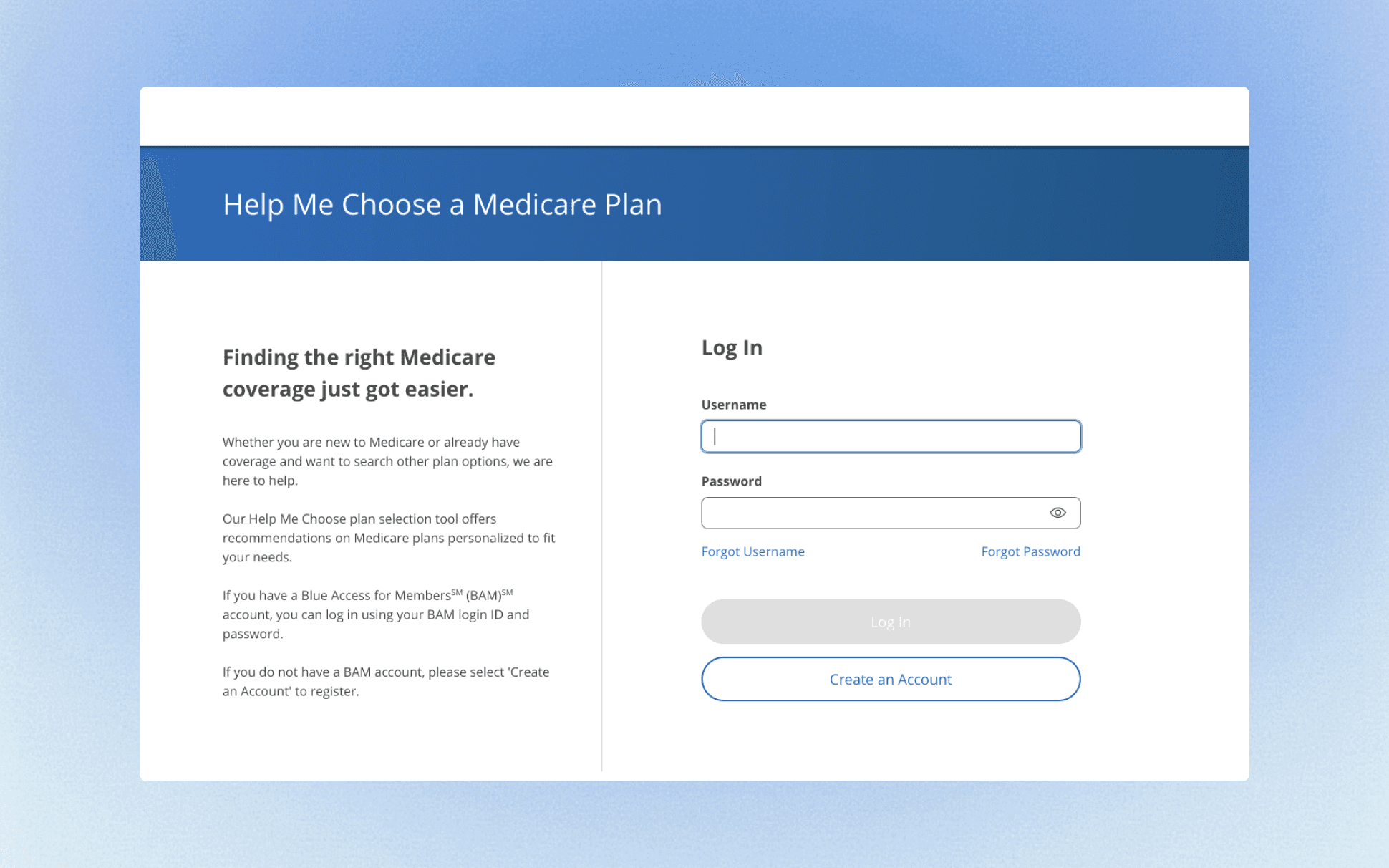
Let's Dive Into the Original Design
In this section, I’ll talk about the pain points we uncovered through extensive user research.
02
After Identifying the Pain Points
03
Users had trouble finding key information, leading to confusion and poor experience.
Users struggled to create accounts required for accessing services.


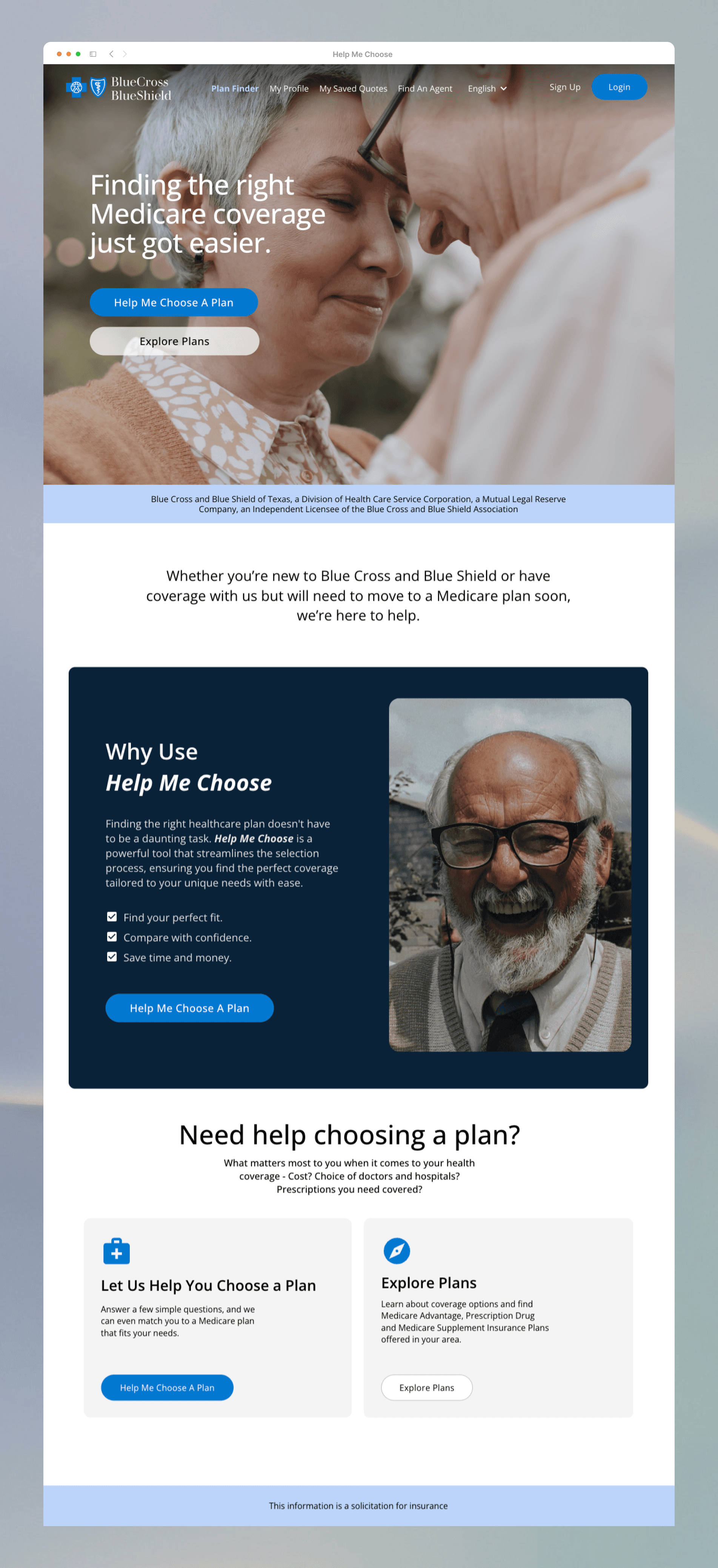
Based on the data, these are the improvements we decided to implement to enhance the homepage's clarity and user experience. We thought it would be helpful to add the following:
1. Clear Value Proposition
Concise, compelling messaging that immediately communicates value
Comprehensive description of the tool's core benefits
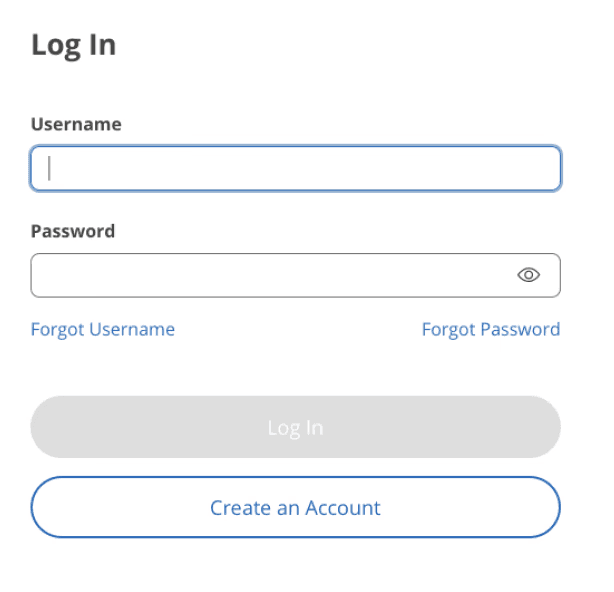
2. Account Creation Benefits
Detailed explanation of advantages users gain by creating an account
Specific features and capabilities unlocked through registration
Clear, tangible benefits that motivate user sign-up
3. User Experience Elements
Streamlined, intuitive page layout
Visual hierarchy guiding users through key information
Strategic placement of call-to-action buttons
Clean, modern design that enhances readability
4. Key Information Sections
Tool functionality overview
Quick access to key features
05
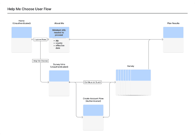
We Added Guest Accounts
Guest Account
Explore Plans: No account creation needed.
Increased Conversions: Lowers entry barriers.
Easy Setup Post-Purchase: Register after buying.
Member Account
Save Plans: Store and retrieve favorites.
Prescription History: Track past prescriptions.
Provider Link: Connect with healthcare providers.

07
A Breakdown of the Newly Re-Designed Homepage

Conclusion
Through extensive research and iterations, we landed on something promising
Users First: From the initial research to the final testing, we kept users' needs and preferences front and center. Every decision was driven by user feedback.
Innovative Thinking: The member and guest account options, along with the optional survey for personalized results, show our commitment to innovation and meeting diverse user needs.
Iterate, Iterate, Iterate: The iterative approach to design and testing, especially during development and delivery, was key to refining the tool and ensuring it's relevant and usable.
Visuals Matter: The redesigned screens and flow charts effectively communicated changes and helped stakeholders and the team stay on the same page.
09

10

11